![2019 the story of [e]. logo_1x1_PR.png](https://static.wixstatic.com/media/dba1d0_95ebe11c64cf44d696d9898db19ac6b9~mv2.png/v1/fill/w_63,h_57,al_c,q_85,usm_0.66_1.00_0.01,enc_avif,quality_auto/2019%20the%20story%20of%20%5Be%5D_%20logo_1x1_PR.png)

Client
Inspired to Write Author's Workshop
Project Scope
Logo Design, Branding, Marketing Consultant, Campaign Management
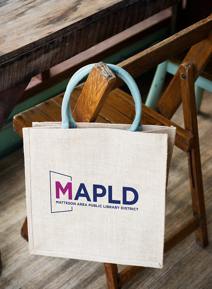
About the Client
MAPLD is a welcoming hub located in the south suburbs of Chicago.
Serving as an open door to the community, the library offers patrons access
to resources, programs, and possibilities that inform, inspire, and connect.
The Challenge
The goal was to craft a brand identity that felt both authentic and forward-thinking, one that captured the spirit of a modern library without leaning on overused symbols or dated visuals. The design needed to honor the library’s mission as a welcoming community space while feeling fresh, engaging, and free of clichés often associated with traditional library branding.


Our Solution
To help the library stand out and feel memorable, a clean, timeless logo was designed around a simple but powerful symbol: a door. It represents the many opportunities and resources unique to this library—offering more than just books. The final identity avoids clichés, feels fresh and modern, and reflects the library’s mission as a place of access, learning, and possibility.

Services Provided
√ Brand Strategy
√ Logo Design
√ Brand Design
√ Brand & Social Media Guidelines Creation
√ Marketing Design, Signage
√ Marketing Consultant
√ Project Management
√ Print Coordination
√ Adobe Creative Suite Training (InDesign, Photoshop, Illustrator, Acrobat) — trained staff on how to use and customize branded templates for consistency across platforms

LOGO VARIATIONS

MAPLD HORIZONTAL LOGO WITHOUT TAG
ICON

MAPLD HORIZONTAL LOGO WITH TAG
ICON #2
(IN HOUSE ONLY)